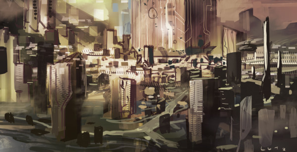
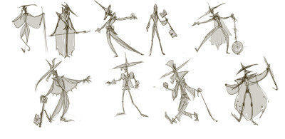
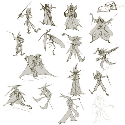
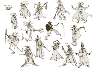
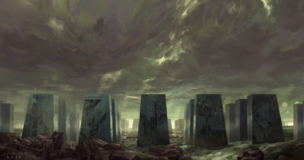
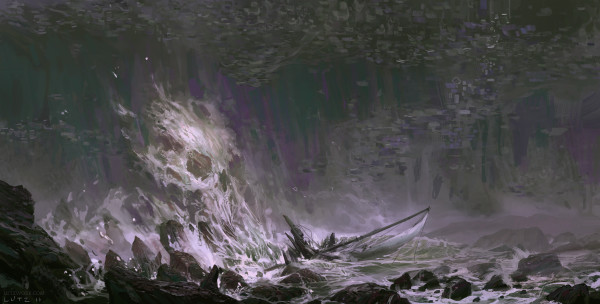
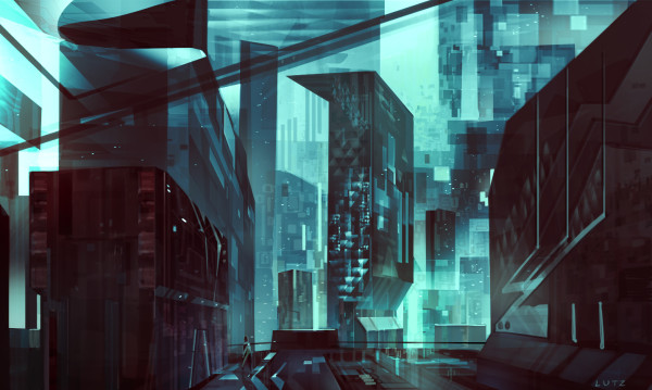
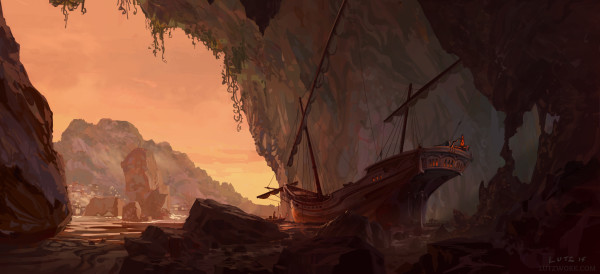
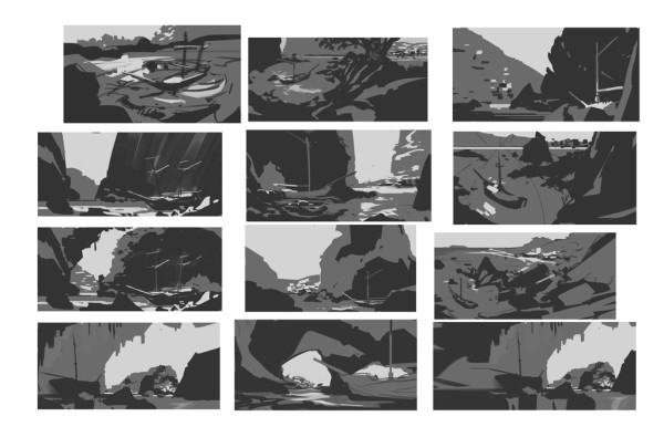
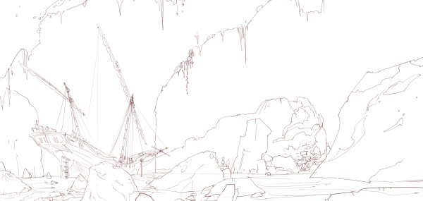
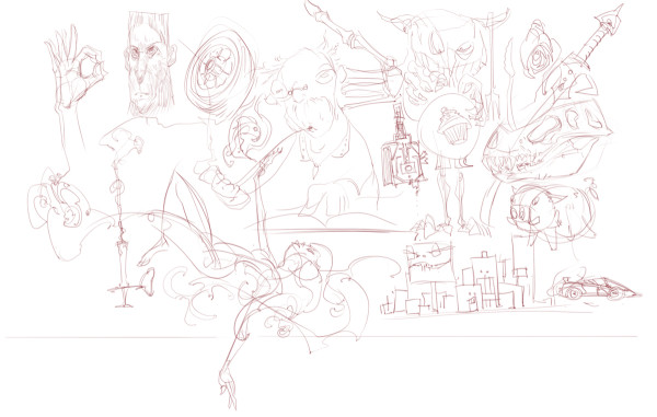
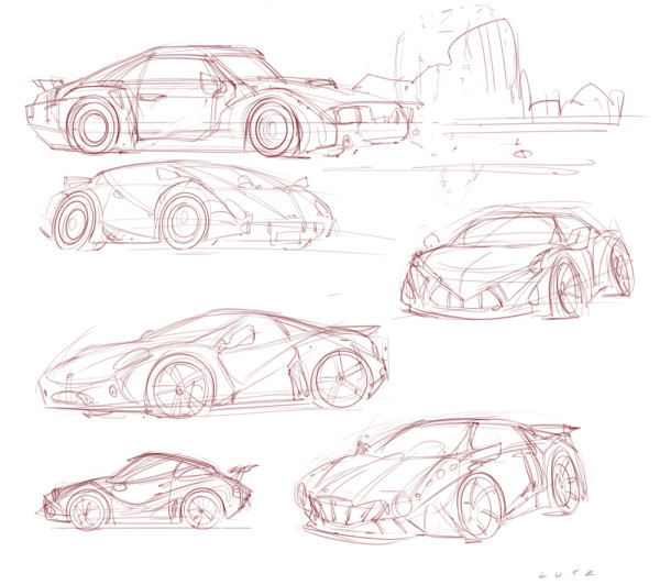
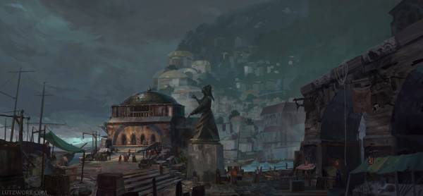
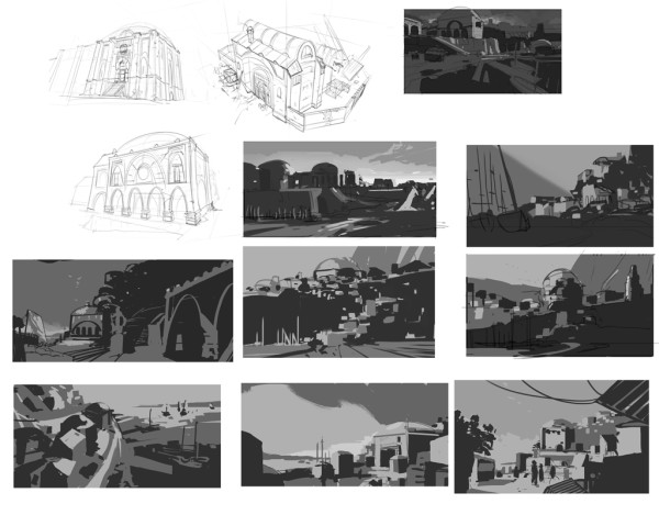
been very busy- new job yadda yadda yadda. sketching:
Category: Uncategorized
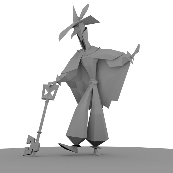
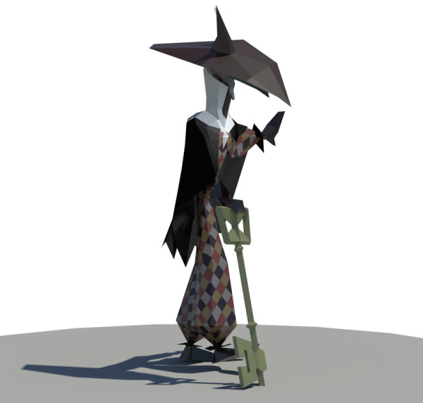
new rig, new render
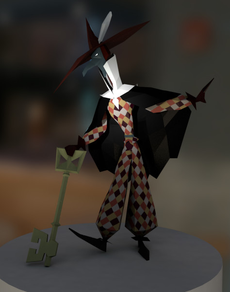
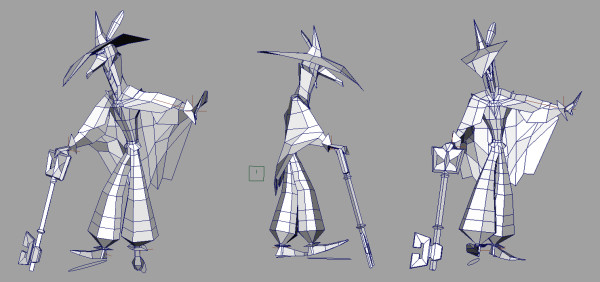
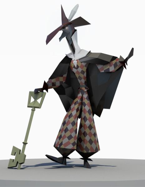
i built a new rig for this guy after getting some feedback on the last one.. the last one was horrifically janky. this one is only tremendously janky. Also spent some time learning about mental ray and got a much nicer render out of it, even if it did take a half hour for the single frame. I need a better computer.
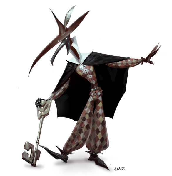
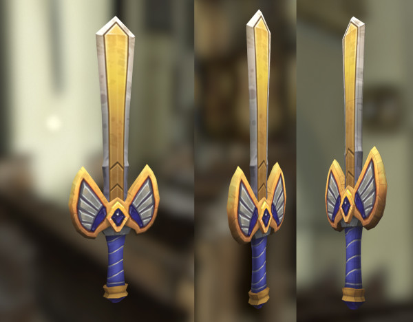
The Harlequin Mage. Now in 3d!
Maya was being a real pain in the butt, but this thing got done. Concept, model, texture, rig, pose, render- a learning experience. The concept work was all photoshop, as usual, and the 3d is 100% Maya. Modeling this thing out was way fun- rigging and rendering in Mental Ray were time consuming though- that Physical Sun/Sky button is a dangerous road to travel.
models
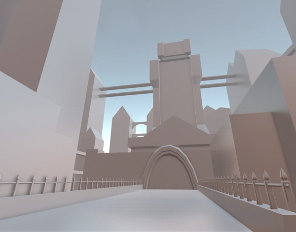
alien world
new stuff
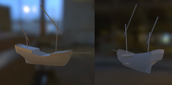
pirates! PIRATES!
thinking about concept design
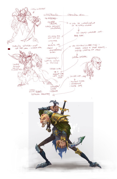
These are some results of a game/exercise I’ve been playing with during the design process. The general idea is that there are two kinds of thinking that have to happen with a successful design: storytelling, which is the visual communication of emotional ideas, and internal logic, which is making it all make sense in the context of the world. The notion is to start with a storytelling element, figure out how to justify it logically, then bring that back into the storytelling with fresh elements to add to the design.
Lets back up to those terms for a second though. The good guy has a plain, open pose, while the bad guy hides behind his tattered cape (storytelling). In addition, the good guy is inexperienced, while the bad guy is crafty (logic). The trick is that while storytelling ideas can be communicated visually, logical ideas need to be translated — a “plain, open pose” can be drawn, but “inexperienced” needs translation. The easy route here is to make the good guy young (youth is a good standin for inexperience) and the bad guy old (old people are crafty).
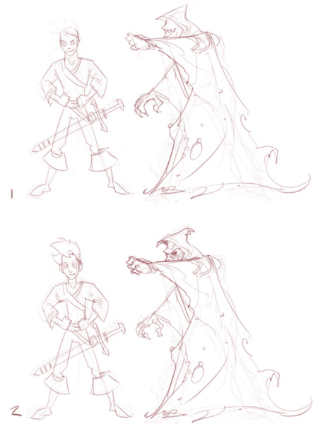 The exercise here is to use that translation process to help add juice to a design. Here’s an example sword:
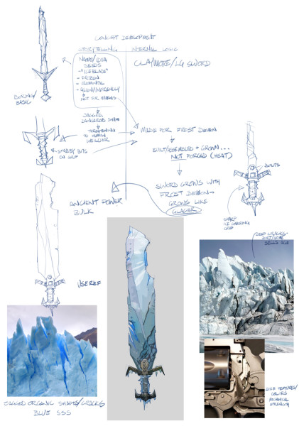 The prompt was ‘iceblade’, which led to the boring-ass drawing in the upper left.. very literal, not gonna knock anyone’s socks off. So i had the notion of the sword being painful to use- a real unfriendly piece of equipment- which led to putting spikes on the handle. This is all storytelling- there’s no logical reason to do it, it just provokes an emotional response in the viewer. So then the question is ‘how do we justify this storytelling element?’ which takes us into the logical realm- maybe this sword is for an ice demon (logic). If that’s true, how would it get built? how does an ice demon get a sword ? ‘forging’ a sword seems like a hot process, one that an ice demon wouldn’t like .. what if he grew it like a glacier, with layers of frozen evil? (logic).. which leads us back to the storytelling- we translate this idea of old, frozen glacier sword back into visuals, with some reference to help along the way.
Next I tried this same sort of process with a character. The prompt was ‘the buzzard’, and me looking at cool pictures of vultures on the google. First thing I drew wasn’t terribly interesting-
So I started by giving him some more fancy equipment (story) because maybe he works for the king (logic). If he’s taking out the king’s enemies and cleaning up his messes, maybe he picks clean the bodies of his noble victims (logic.. ties back to the name), so he has all kinds of fancy stuff he’s taken from them, some of it mismatched (logic).. which leads to drawing out a bunch of his equipment in slightly different styles (story). He also oughtta look skeletal and unhealthy (story) – how’s he gonna take out his enemies like that though? (logic)- well, he fights dirty. poison, surprise attacks, misdirection (logic)- so lets give him a wickedly curved, poison-dripping blade, and a sneaky pose (story).
I’m not quite done exploring this idea, but had enough to start talking about it with folks- feel free to drop me a line if you have some insight or something to add. [ m at lutzwork dot com ]
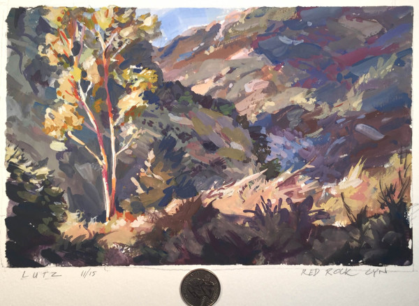
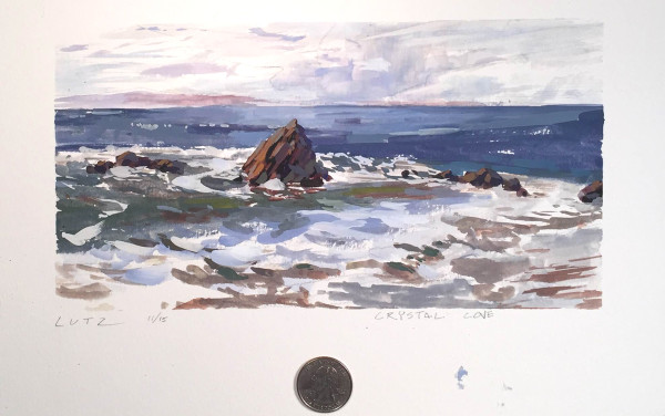
Also, here are a couple of sketchbook pages and a plein air gouache painting.

